A bold digital identity designed to stand out and support brand growth
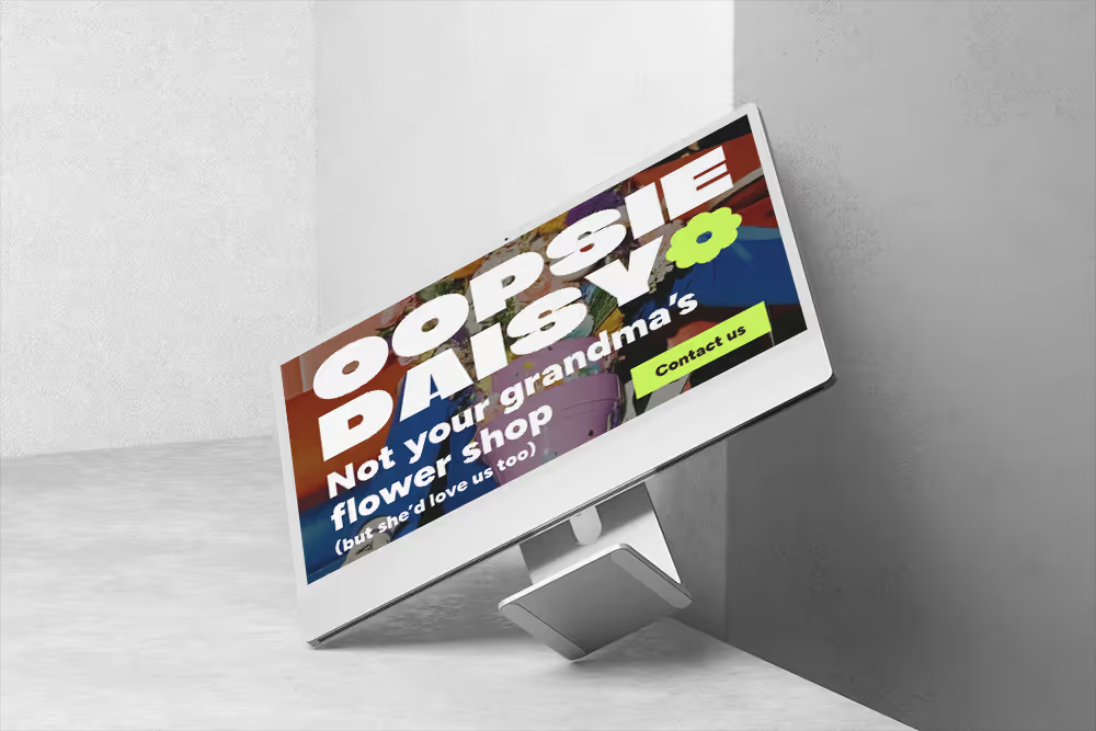
Designing a distinctive brand and website for Oopsie Daisy — a flower shop with a strong personality, expressive visuals and a growing online presence.
Starting point
A strong brand offline, ready for a cohesive digital identity
Oopsie Daisy already stood out offline — bold colors, playful tone and a recognisable personality. The goal wasn’t to reinvent the brand, but to translate its energy into a clear, cohesive digital experience.
The website needed to express the brand’s character while introducing more structure, clarity and direction for future growth.
Project Scope
Brand design direction
Lo-fi and hi-fi web design
UX structure and information hierarchy
UI components and design system foundations
The Approach
Designing a brand-led website with personality and clarity
The project began with defining a strong visual direction that could express the playful, expressive character of Oopsie Daisy while remaining clear, usable and conversion-focused. The goal was to create a brand and website design that feels bold and memorable, without sacrificing structure or usability.
SYSTEM & SCALABILITY
A brand system rooted in the online experience
The brand system was not designed to evolve endlessly, but to clearly reflect Oopsie Daisy’s online activity and personality.The focus was on translating the brand’s playful, bold character into a cohesive visual language that supports visibility, recognition and consistent communication across digital touchpoints.
The system provides a clear framework for building brand presence online — ensuring visual consistency while allowing the brand to show personality, confidence and clarity in every interaction.This approach supports long-term brand building rather than constant redesign or reinvention.
With a clear understanding of the brand’s goals and audience, the focus shifted to visual identity. The aim was not to design a flexible system, but to create a strong, expressive brand that clearly communicates Oopsie Daisy’s character and supports its online growth.
Process
From brand foundations to a bold, intuitive web experience
The process focused on translating Oopsie Daisy’s playful, expressive brand into a clear and intuitive digital experience.Strong visual identity, unconventional aesthetics and bold composition were carefully balanced with structure and navigation — ensuring that even a visually loud design remains easy to explore, understand and use.
Understanding the brand and its online presence
The process started with understanding Oopsie Daisy’s business, audience and tone of voice. The goal was to capture the brand’s playful, expressive character while defining what makes it stand out in a crowded online market.
Defining brand direction and visual language
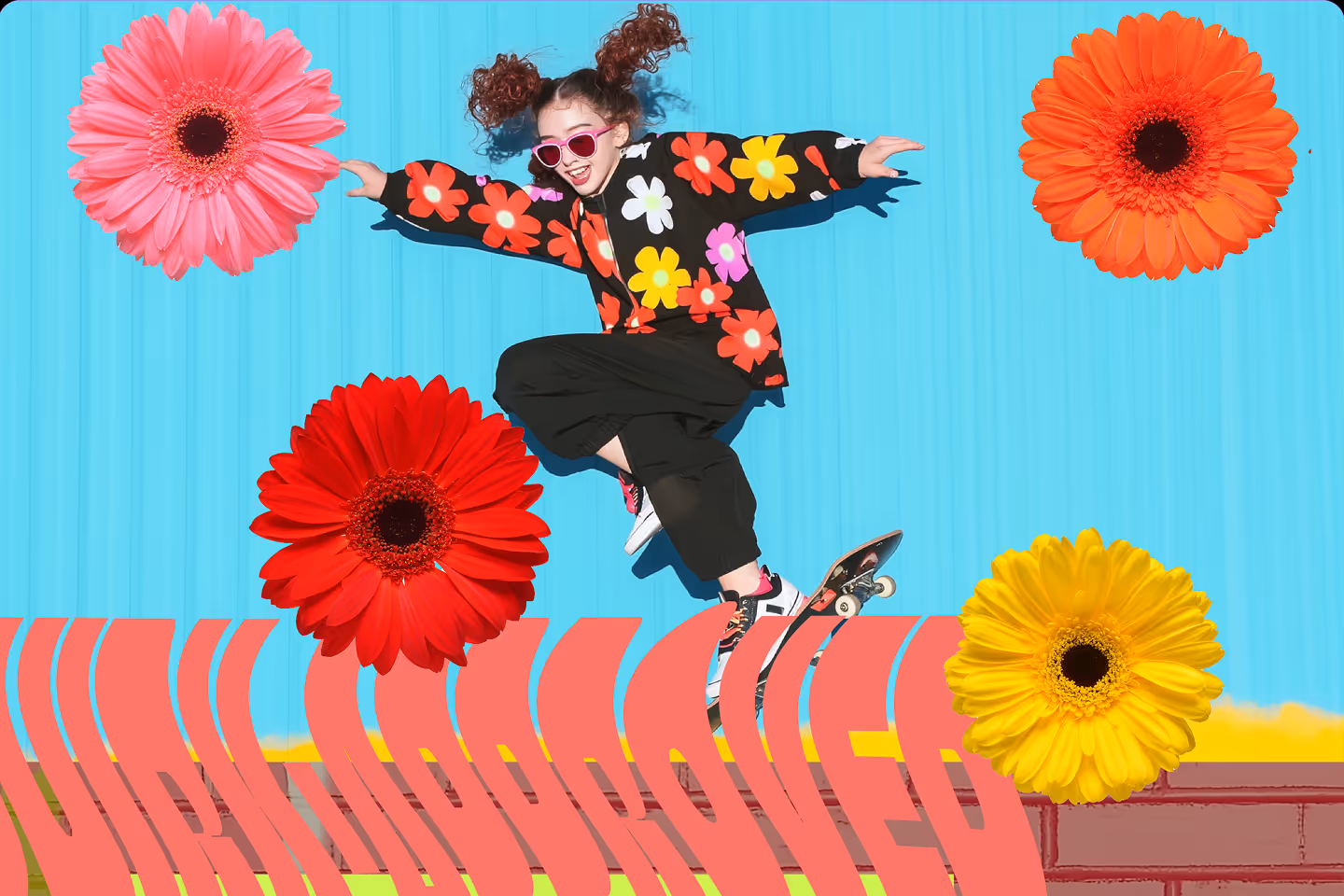
Based on initial insights, a clear brand direction was established. This step focused on translating personality into visual principles — boldness, humor, color confidence and recognizability — before moving into execution.
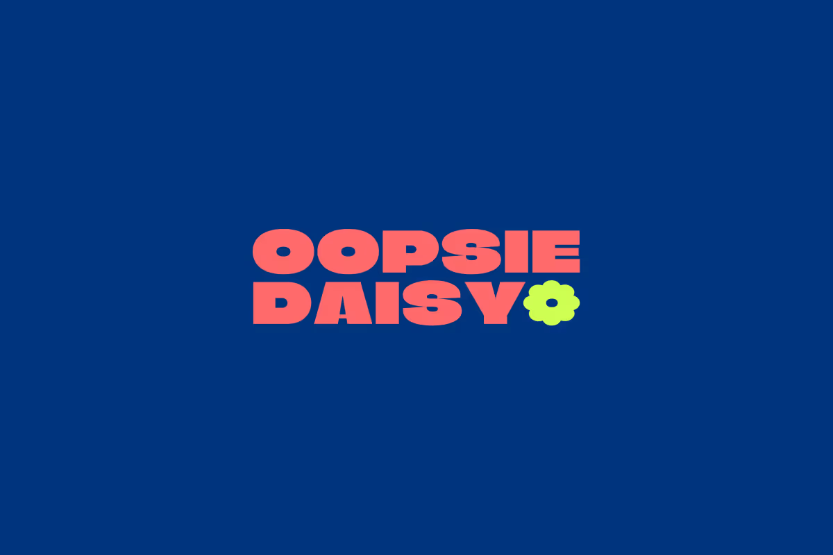
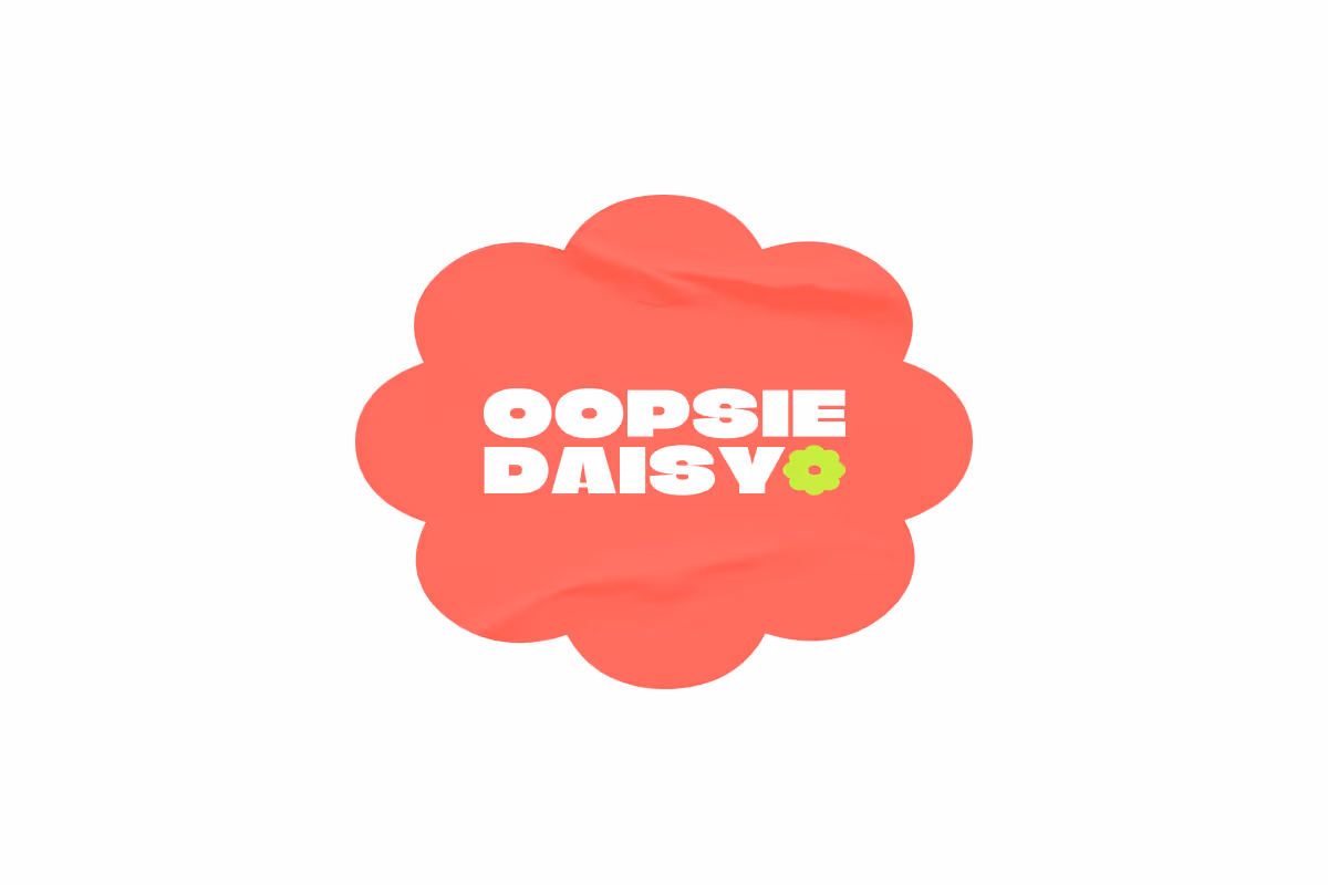
Brand identity design
The visual identity was designed to feel distinctive and memorable, while remaining practical for digital use.This included logo design, brand elements (such as stickers) and defining how the brand should visually communicate across touchpoints.
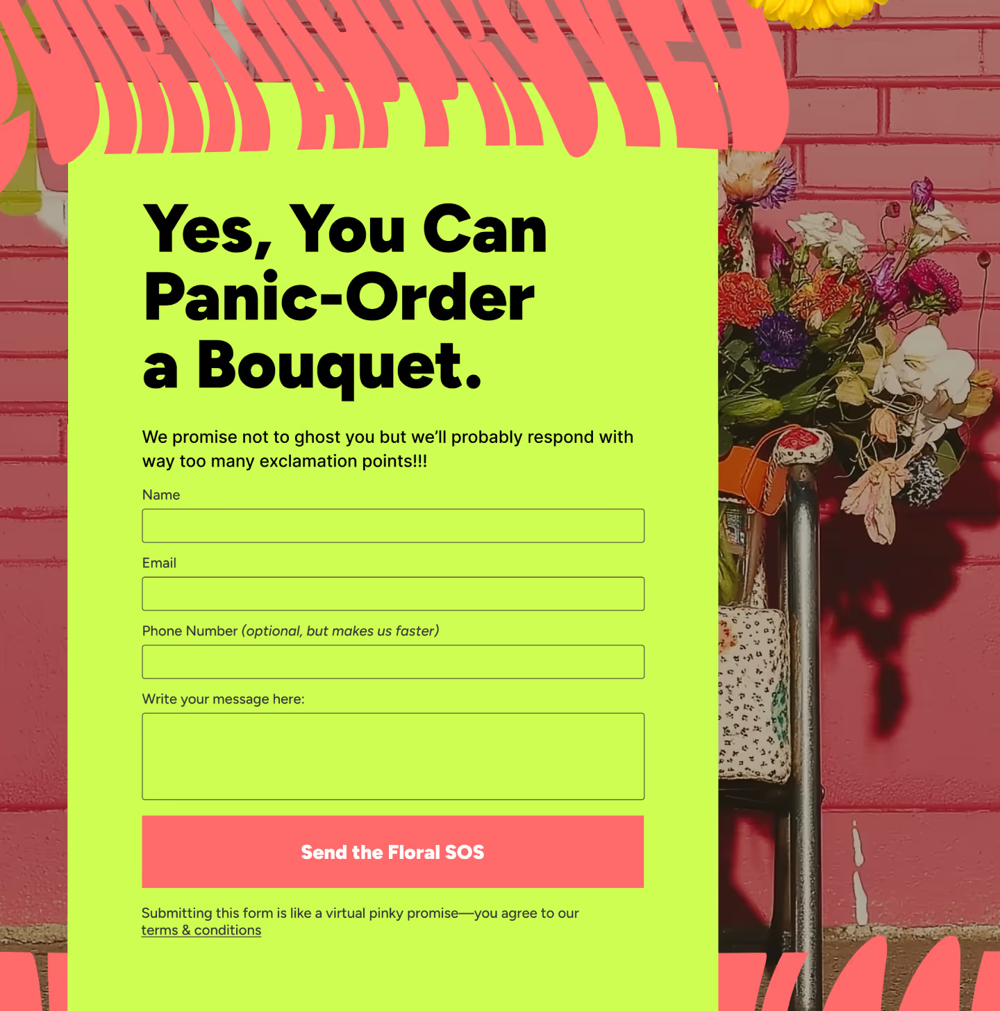
Website design and content structure
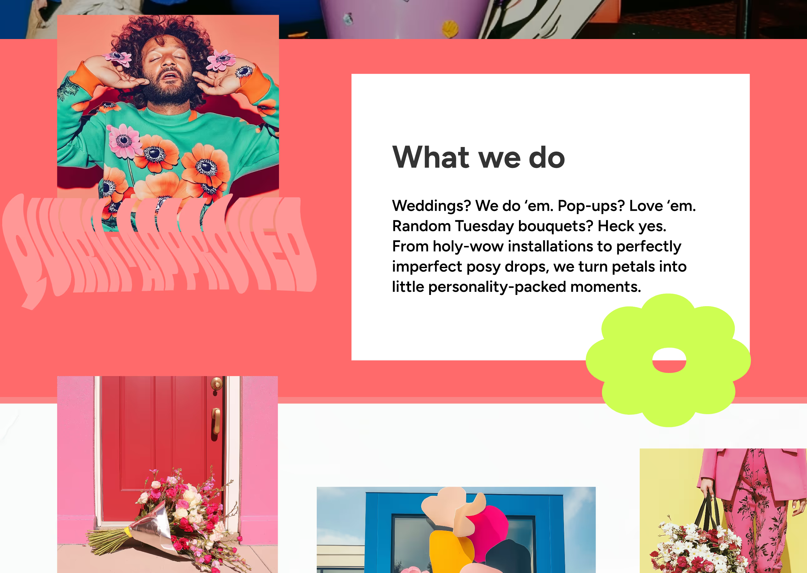
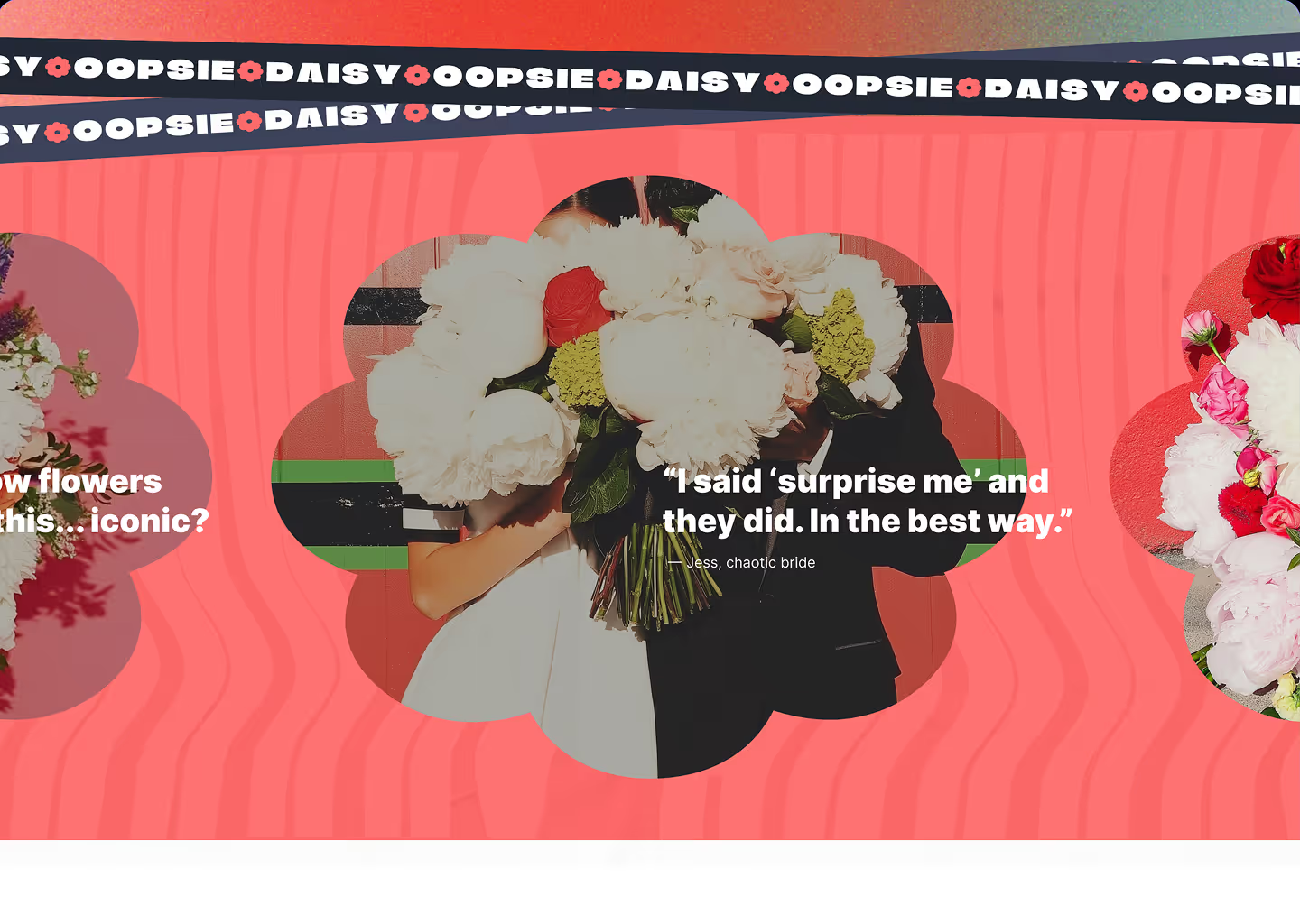
With the brand defined, the website design focused on clarity and conversion. Layouts were created to balance expressive visuals with clear messaging, guiding users naturally through the offer without overwhelming them.
Visual refinement and consistency
The final step focused on refining details and ensuring consistency across the brand and website. Typography, color usage, imagery direction and UI elements were aligned to create a cohesive, recognizable experience.
UI & visual design
A clear visual language supporting a bold brand
The visual layer was designed to translate Oopsie Daisy’s expressive brand into a clear and usable interface. The focus was on consistency, recognisable patterns and readability — not on building a complex or evolving system.
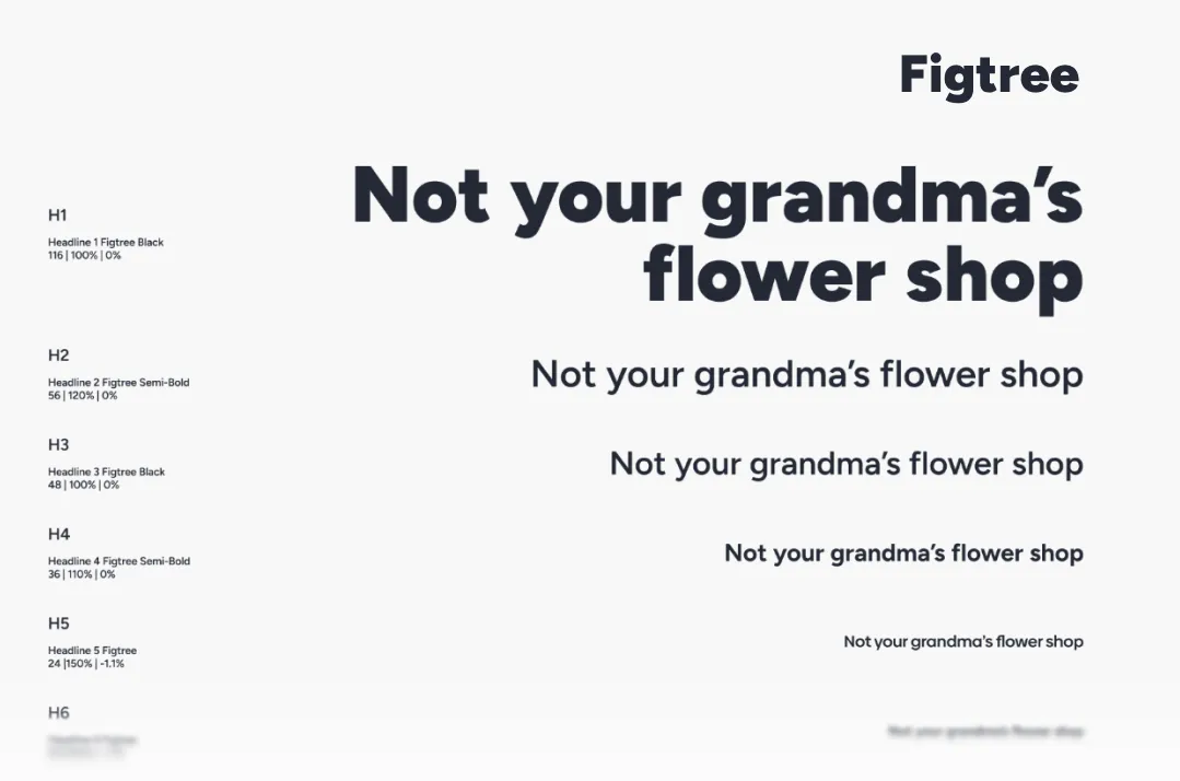
A limited type scale with clear weight hierarchy, supporting expressive headlines and readable body content.
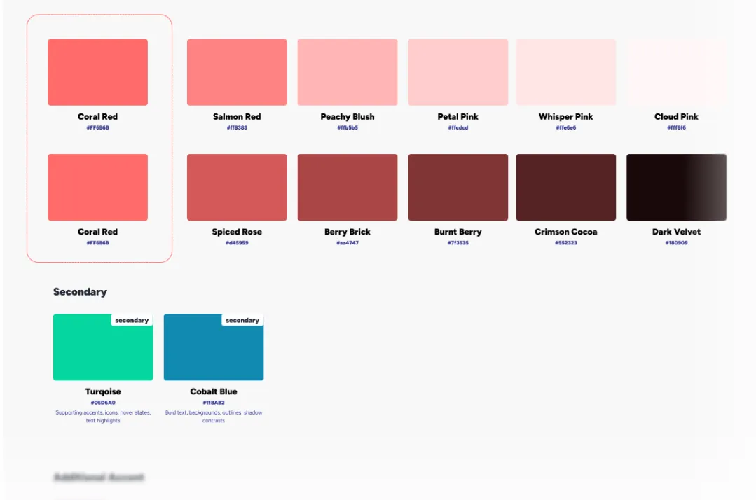
A restrained color palette derived from the brand — used to highlight actions, guide attention and reinforce recognition.
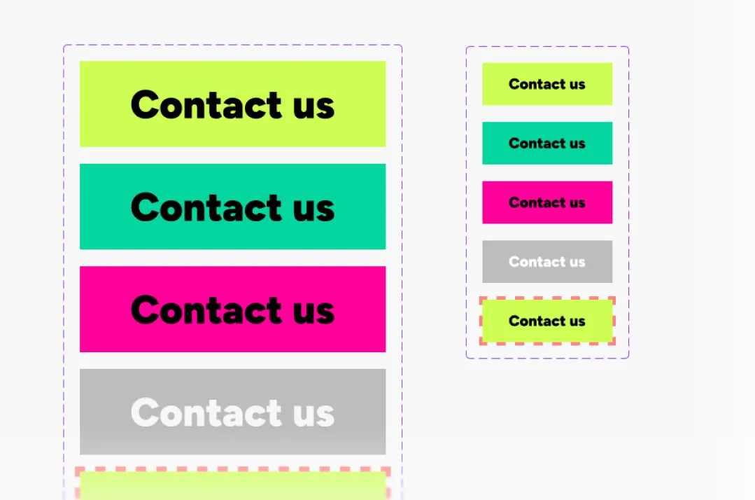
Reusable components with clear states ensure visual consistency and intuitive interaction across the site.
From brand idea
to digital presence
Translating brand personality into a cohesive digital system
The final stage focused on translating the brand identity into a consistentand usable digital system. The goal was not to build a website, but to definehow the brand behaves online — visually, tonally and structurally.
The result is a set of brand and UI foundations that ensure the website feelsbold, expressive and recognizable, while remaining clear, intuitive andconversion-oriented.
The visual system allows Oopsie Daisy to:
express a playful, bold personality without sacrificing clarity
maintain visual consistency across pages and touchpoints
scale content and marketing visuals without redesigning every element
ensure a smooth handoff for future development or implementation
Outcome
A bold and cohesive digital brand foundation
The result is a distinctive brand and website design that clearly communicates Oopsie Daisy’s personality while remaining structured, usable and conversion-focused.
The final designs provide a strong visual foundation for future growth — ensuring consistency across digital touchpoints and supporting brand recognition from the very first interaction.
A clear structure and expressive visuals make it easy to understand the brand, explore the offer and take action with confidence.
A cohesive visual language strengthens recognition and ensures the brand feels consistent across website, marketing and social channels.
The design provides a flexible foundation that can evolve into a full website build or expand across additional brand touchpoints.
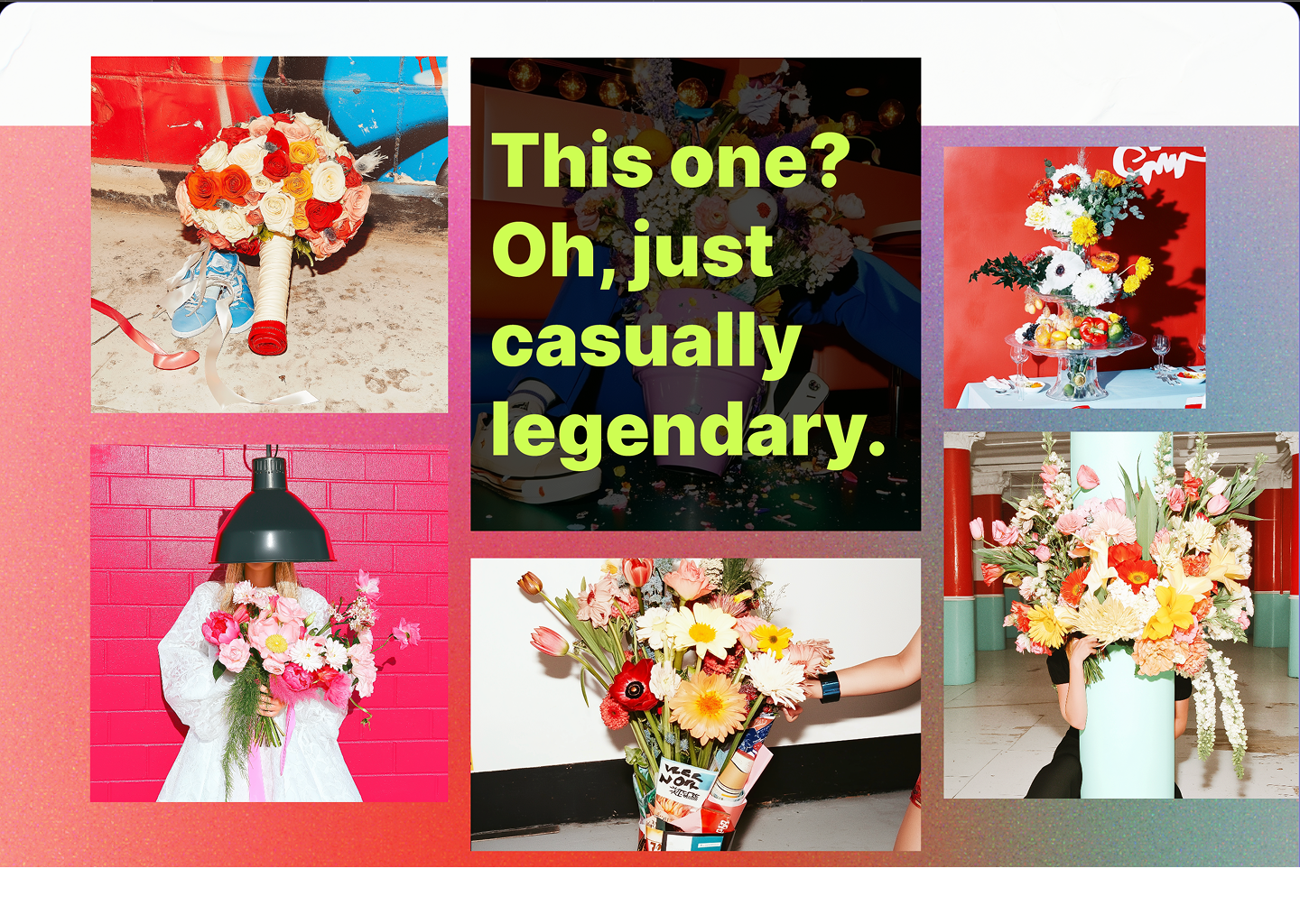
Selected views
This project highlights that even the most expressive, bold visual identities can support intuitive navigation when structure and hierarchy are designed with intention.